How to Improve Text Readability

Readability is often thought as the most important aspect of web usability. Effective readability can boost your conversion, attract more new visitors and retain old.
Good readability rules:
Consider Contrasting Colours
It is easier to read the text if the test and the background colours are in contrast. Avoid such colour combinations as blue on red, yellow on white or grey on black.
Make text scan-friendly
Large paragraphs with no headings and small fonts will intimidate even the greatest fan of your blog/site.
- Use subheadings (h2, h3…) as they help readers to structure the information. Make them brief and meaningful.
- Use bulleted lists.
- Keep lines short (the best length is between 50-60 characters).
- Make more space between the lines – the standard line height is usually too small.
- Make your links look like links, meaning that good old blue underlined links are a conventional practice and you want to make your links to be recognizable, so be creative somewhere else.
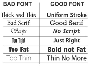
Choose font style wisely
Beautiful decorative styles are usually pretty hard to read if it’s more than one sentence. Sans-serif fonts like Arial and Verdana make texts more readable but if you like fancy fonts that much, you can use them for headlines as they are not very long and easy to scan.
And the last but not the least, stick to the point. All readers want is to quickly find what they want so keep it brief and to the point.


